Share The Love
Recent Posts
Someone Is Deciding Where to Eat Right Now, on a Phone
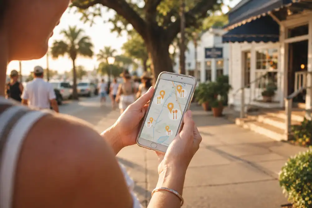
It is six in the evening on the causeway. A family has been on the beach all day. Nobody wants to cook. So one of them pulls out a phone and searches, and in the next ninety seconds they choose where to spend eighty dollars.
Your food never enters into it. At that moment they are judging your Golden Isles restaurant website and your Google listing, because that is all they can see. This is what those ninety seconds actually look like, and what your site needs to survive them.
The Four Things They Check First
Watch someone do this and the pattern is always the same. First, are you open right now. Second, where are you and how far. Third, what is the food actually like. Fourth, is anyone else saying you are good.
So a Golden Isles restaurant website has to answer all four without making anyone hunt. Not buried in a menu, not three taps deep, and definitely not below a paragraph about your culinary philosophy. That can live further down for the people who care.
The PDF Menu Is Costing You Tables
Here is the single most common mistake we see, and it is worth fixing this week.
Your menu is a PDF. On a laptop that is fine. On a phone it opens in a separate viewer, loads slowly, and arrives as a full page shrunk to thumb size. Now your hungry searcher is pinching and dragging to read a starter list. Meanwhile the place down the street has a menu they can simply scroll.
Most of them do not persevere. They go back and pick someone else, and you never know it happened.
A menu should be real text on a real page. Then it loads instantly, it reflows to the screen, Google can actually read it, and you can update a price without opening design software. Keep the PDF as a download for anyone who wants to print it. Just do not make it the only way in.
Show the Room, Not Just the Plate
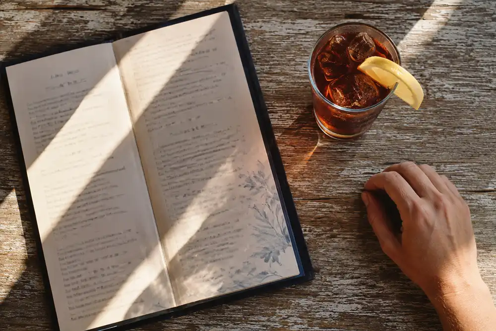
Most restaurant sites show food and stop there. Food photos matter, obviously. But people are also asking a quieter question: will I feel right in there?
A family in flip-flops wants to know they will fit in. A couple out for an anniversary wants to know they are not walking into a sports bar. So show the dining room, the bar, the patio under the oaks, the view if you have one. One honest photo of the space answers a question your menu never can.
Shoot it yourself if you have to, in daylight, and skip the stock photography. When we worked on Chubs Diner we photographed the food ourselves for exactly that reason. Every dish on the menu was the dish you actually got.
Make the Next Step One Tap
Someone has decided. Now do not make them work.
Your phone number should dial when someone taps it, rather than making them copy it out. Your address should open in Maps. If you take reservations or online orders, that button belongs where a thumb naturally rests, near the bottom of the screen. Ultimately, every extra tap between deciding and acting is a chance to change their mind.
And keep it fast. Visitors are often on patchy cellular signal out here, so a site heavy with sliders and video will lose people before it finishes loading.
Your Site and Your Google Listing Have to Agree
Here is the part most owners miss. For a lot of these searches, your website is the second thing people see. The first is your Google listing.
So if your hours differ between the two, or your listing shows a menu you stopped serving last spring, that mismatch works against you. Google reads both and notices. More to the point, so does the customer standing outside a door you said would be open.
We wrote a full owner’s guide to getting your Google Business Profile right, and for a restaurant it matters as much as the site itself.

Two Audiences, One Site
One thing makes a Golden Isles restaurant website different from one anywhere else. You serve visitors and locals at the same time, and they want opposite things.
A visitor needs orientation: where you are, what kind of place this is, whether to come now. A local needs a reason to return: what changed, what is on this week, what is worth driving over for. In short, the front of your site should answer the visitor, and something further down should keep the regulars interested.
For Vampire Penguin in Brunswick, that meant a site as bright and easy as the shop itself, with the menu doing the selling and every new flavor easy to put up.
Where to Start if All of This Is Overdue
Do not rebuild everything at once. Instead, fix the parts of your Golden Isles restaurant website in the order that costs you customers.
First, get the menu off the PDF. Second, check your hours match your Google listing, especially heading into the shoulder season. Third, make the phone number tappable. Those three take an afternoon between them and they recover the most.
After that, the photos and the speed are worth real attention. If you want the wider picture of how the whole brand fits together, our free Restaurant Brand Identity guide covers the logo, the menu, the site, and the social side. No form to fill in.
Ready for a Site That Fills Tables?
A good Golden Isles restaurant website comes down to three things. It loads fast, it tells the truth about what you serve, and it makes the next step obvious. See how we approach web design for coastal businesses, then reach out for a free, no-pressure quote. You work directly with the designer, start to finish.