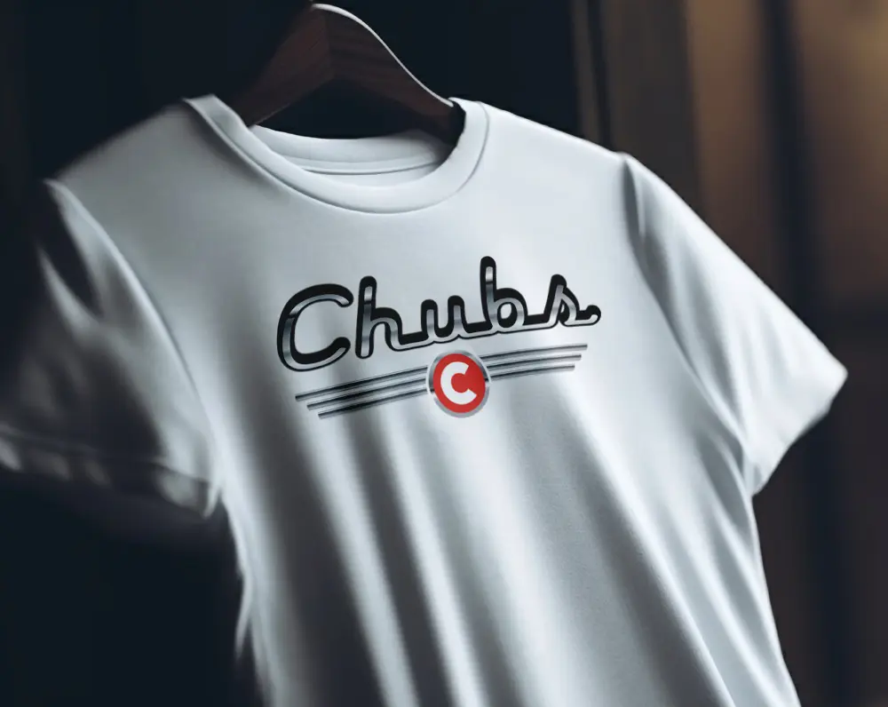
A Fresh Take on Classic St. Simons Restaurant Branding
The brief:
Chubs Diner needed St. Simons restaurant branding as fresh as the food. They serve a nostalgic taste of Americana on St. Simons Island. Think tradition, quality ingredients, and friendly service. Their look, though, felt dated next to the plate. So first-timers could not tell what they were walking into. Diners are a crowded category, particularly in a tourist town. In addition, they were competing with newer spots for the same breakfast crowd. Ultimately, the brand had to say classic diner without saying old.
What we did:
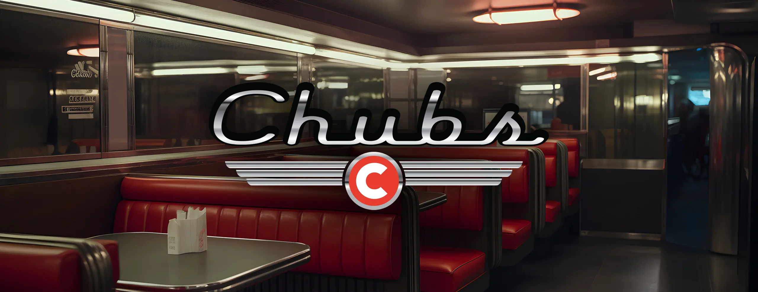
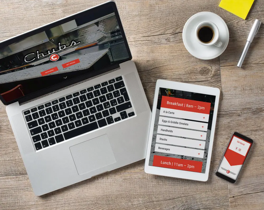
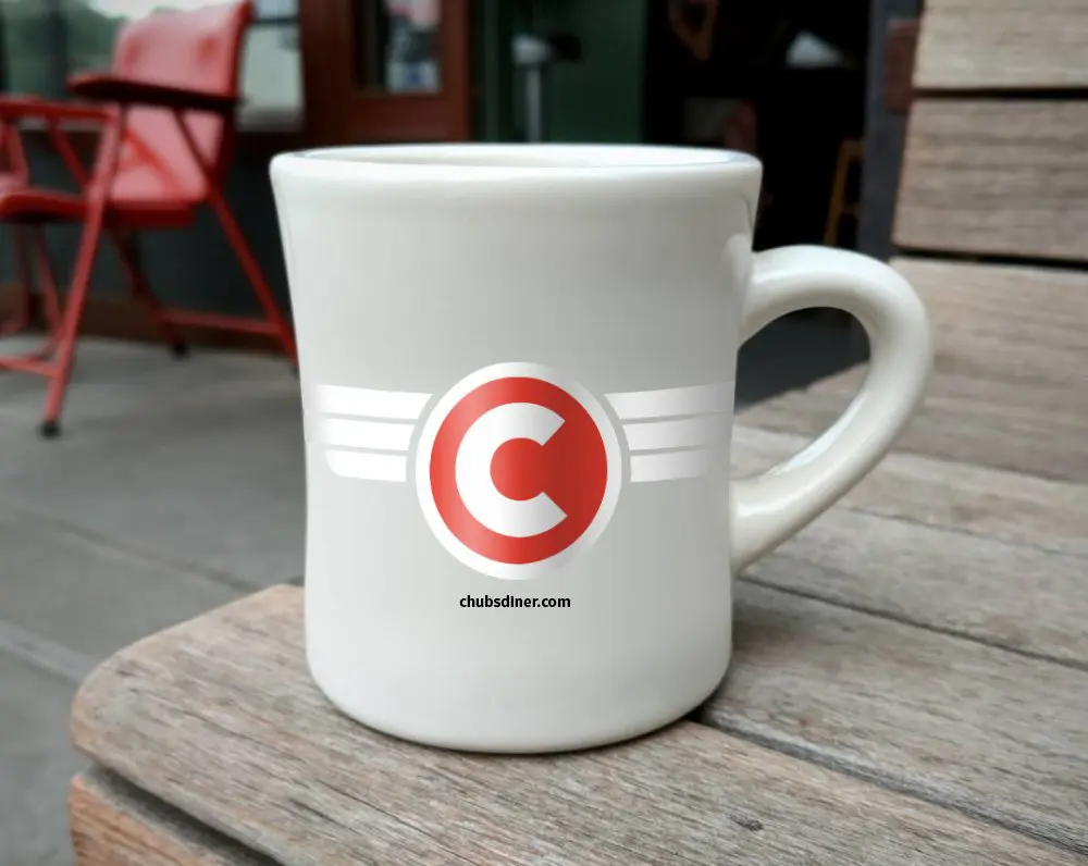
We crafted a vibrant logo that nods to classic diner style. Then we gave it a modern twist, so it reads current rather than retro. Next, we carried the logo across eye-catching menus. Those menus show off the dishes and highlight Chubs’ fresh, never-frozen ingredients. We also shot the food ourselves rather than using stock photography. Consequently, every dish on the menu is the dish you actually get. The custom photography captured the diner’s warm, welcoming atmosphere too. In addition, we tied it together on a website that hungry locals and tourists can actually use. Of course, you worked directly with the designer the whole way.
The result:
Chubs Diner now has St. Simons restaurant branding that looks as good as the food tastes. The logo, the menus, and the website all agree with each other. As a result, new customers can find them and know what to expect. Tourists searching for breakfast can tell it apart from the chains. In particular, the menus do the selling before a server says a word. More importantly, the look earns a second visit. Unlike a generic diner template, this one belongs to Chubs.
Hungry for a brand that pulls people through the door? Take a look at our branding work, then start your project.