

Share The Love
Recent Posts
Why Screens Left Us Hungry for Texture
We spend the whole day sliding a thumb across smooth glass. Somewhere in all that frictionless perfection, something starts to feel missing. That missing thing is texture, and it is exactly what tactile branding puts back. In short, tactile branding is the practice of making a brand feel physical. That holds whether it lives on a screen, a business card, or a sign above a door.
So why is a sensory idea suddenly one of the most talked-about moves in design? And how do you use it without turning your brand into a craft-fair cliche? First, let us pin down what the term actually means. Then we will walk through where it earns its keep, on the screen and off it.
What Is Tactile Design?
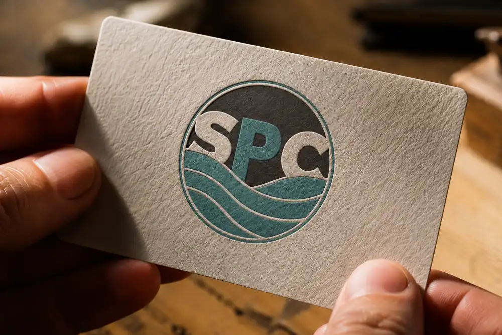
Tactile design is design that appeals to the sense of touch. Sometimes that is literal, through physical materials. Other times it is visual, through cues that make a flat surface look like it has texture, weight, and depth. In print, that might be an embossed logo or a soft-touch paper. On a screen, it is the grain, the shadow, and the hand-made imperfection. Together they make a pixel-based layout feel like an object rather than a slide.
In other words, it is the opposite of the weightless, interchangeable look that took over the web for a decade. Tactile branding is simply what happens when you apply that thinking to a whole identity. Every touchpoint then carries the same physical character.
The Digital Deluge and the Craving for Connection
For years the internet promised endless information and effortless experiences, and it delivered. Yet it also handed us a new problem: digital fatigue. Screen after screen looks the same, flat and uniform, so brands shout louder or add another gradient to stand out. Meanwhile, people are quietly worn out by all of it.
But humans are tactile creatures. We read the world through our fingertips, through weight and grain and temperature. So when everything on a screen is glassy and identical, a real pull sets in. We start to want something that feels made. That pull is the whole opportunity here. Tactile branding invites an audience to feel a brand, even when there is nothing to physically hold.
Tactile Branding on a Screen: What It Actually Looks Like
Tactile branding does not mean dropping a grain filter over everything. Instead, it uses deliberate visual cues to suggest texture, depth, and the presence of a real material. In practice, it tends to show up in a handful of ways.
First, subtle textures and grains. Picture a faint paper grain behind a headline. Or a soft weave beneath a logo, a distressed edge on an illustration. These read as material rather than mere decoration.
Second, depth and shadow. Careful highlight and shadow can lift a button or a card off its background. It then behaves the way a physical object would under light. As a result, the eye treats it as something you could pick up.
Third, organic and imperfect elements. Forget sterile, vector-perfect lines. A tactile approach welcomes the hand-drawn stroke, the uneven edge, the mark that came from a human hand.
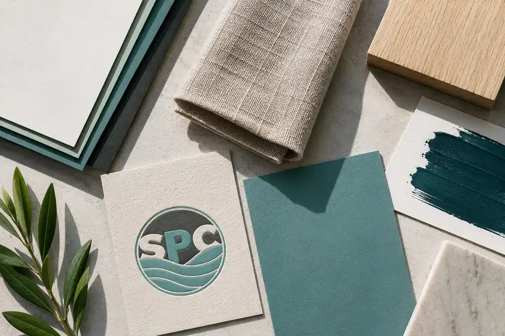
Fourth, materiality in the palette. Colors and finishes borrowed from wood, clay, linen, or aged metal carry a physical association. They keep it even on a screen that is none of those things.
Finally, motion that obeys physics. Animation can mimic paper crumpling, fabric settling, or an object dropping under gravity. That makes an interface feel governed by the same rules as the real world.
Tactile Branding Off the Screen: Print You Can Actually Feel
Here is the part a lot of digital-first advice forgets. The most powerful tactile branding you own is often the kind a customer literally holds. Print is where touch stops being a metaphor. It is frequently where a small brand makes its strongest impression for the least money.
Consider the humble business card. Take one design. Print it on flimsy stock, then on a thick, cotton, letterpressed card. You do not have the same card at all. One gets tossed in a drawer. Someone keeps the other and shows it to a friend. The choices behind that are small. A heavier paper. A debossed mark you can run a thumb over. A soft-touch coating. A spot of raised gloss on the logo. Each one turns a flat rectangle into an object with presence.
The same logic runs straight through packaging, menus, signage, and mailers. A textured menu tells a diner the kitchen cares before they read a single dish. Likewise, uncoated recycled stock signals a very different brand than a high-gloss sheet, and neither is wrong. They simply say different things. For any business selling craft, food, or something handmade, print texture is not a luxury add-on. Instead, it is often the most honest expression of what the brand already is.
Why Tactile Branding Works
None of this is decoration for its own sake. Tactile branding earns its place because it does a few specific jobs, and it does them well.
It makes you memorable. A brand that engages more than one sense, even indirectly, tends to stick. A distinctive texture or a card with real weight lingers long after a flat logo has blurred into the feed.
It signals authenticity. A little imperfection reads as human, and human reads as trustworthy in a sea of over-polished sameness. That matters especially for handcrafted goods, artisanal products, and any business built on genuine craft.
It builds an emotional connection. Our brains process sensory information deeply. So evoking touch can trigger warm, almost involuntary associations: the comfort of natural fabric, the steadiness of wood. Consequently, the bond a customer feels runs deeper than a purely visual one.
It sets you apart. When every competitor is racing toward the same sleek minimalism, a tactile approach is instant differentiation. In effect, it hands you a signature that is genuinely hard to copy.
Finally, it telegraphs quality. For a brand that prides itself on detail and care, the approach proves the point. It does so before a customer has even touched the product.
Where to Start With Tactile Branding
You do not need to rebuild your entire identity to get going. In fact, the smartest move is to add texture where it will be felt most, then let it spread from there. Here is a sensible order across the touchpoints most brands already own.
On your website, begin small. Start with the background: a subtle paper or concrete texture. Add a button with a believable raised edge, or a light overlay on the hero image. Each adds depth without slowing the page down.
In your logo and core identity, find one place to add a hand-made quality. That might be a little grain, a worn edge, a drawn-feeling icon, or a palette pulled from natural materials.
On social media, lean on texture in your templates and overlays. Try a touch of film grain, a torn-paper frame, or a handwritten font used sparingly. Each adds a personal note that a stock template never will.
In print, spend where hands land. If you invest in one thing, make it the piece customers actually hold: the card, the menu, the packaging, the tag. That is the cheapest and most direct texture a small business can buy.
Weighing what all of this costs? Our guide to what a coastal small business should spend on branding lays out realistic numbers. And to sidestep the usual traps, skim the common branding mistakes we see most often before you start.
Ready to Add a New Dimension to Your Brand?
In a world of endless screens, connection wins, and connection is physical. Tactile branding is how you make a brand not just seen but felt. That is true whether someone is scrolling past it or turning it over in their hand.
Getting there starts with the fundamentals agreeing: a mark, a palette, and a set of materials that belong together. That is the groundwork we lay in our brand identity design work for small and growing businesses. So if you are ready to add a dimension your competitors have missed, reach out for a friendly, no-pressure conversation. You work directly with the designer, start to finish.